
A setup can be technically perfect and still be taken at the wrong time.
That is one of the most expensive lessons active day traders eventually learn.
You may have a clean breakout level, a valid trend, strong momentum, and a sensible stop. Yet the trade fails because you entered during the quietest part of the session, just before liquidity changed, or after the market had already completed its most productive move.
The problem is not always the Setup.
Sometimes the problem is when the Setup is traded.
A session heatmap gives you a way to study that question systematically. Instead of assuming that every hour offers the same opportunity, you map where your strategy actually performs best.
The goal is not to discover a magical time of day when every trade works. The goal is to identify recurring combinations of time, Volatility, liquidity, directional behavior, and setup quality.
That distinction matters.
A heatmap shouldn’t read, ‘Always purchase at 9:30.’
This should assist you in answering the question: “When this particular setup occurs in this particular market environment, what session windows have produced the best execution and expectancy historically?”
What Is a Session Heatmap in Day Trading?
A session heatmap is a visual or structured way of grouping trading data by time periods and performance variables.
For example, you might divide your trading day into 30-minute blocks and track:
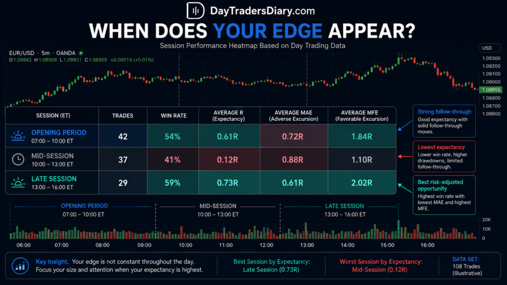
| Time window | Trades | Win rate | Avg. R | Avg. MAE | Avg. MFE |
| Opening period | 42 | 54% | 0.61R | 0.72R | 1.84R |
| Mid-session | 37 | 41% | 0.12R | 0.88R | 1.10R |
| Late session | 29 | 59% | 0.73R | 0.61R | 2.02R |
The visual heatmap is useful, but the real edge comes from the underlying classification.
A profitable time block is not automatically a good entry window. You need enough trades, comparable market conditions, and a reason why that period fits your strategy.
A breakout trader, for example, may find that early-session expansion produces the best follow-through. A mean-reversion trader may discover the opposite and perform better after the initial Volatility settles.
That is why the timing of session heatmap entries is strategy-specific.
Why Time of Day Changes the Quality of Your Trade
Markets do not distribute activity evenly throughout the day. Participation, liquidity, spreads, Volatility, and information flow change as trading sessions open, overlap, and approach their closes.
The Bank for International Settlements has recorded the worldwide and decentralized nature of foreign currency markets, with activity spread across major financial centers, and concentrated through global trade connections. Its Triennial Survey provides useful information for understanding why liquidity levels might differ dramatically across trading hours and regions.
For a day trader, the practical implication is simple.
A chart pattern does not exist independently of the market environment that produces it.
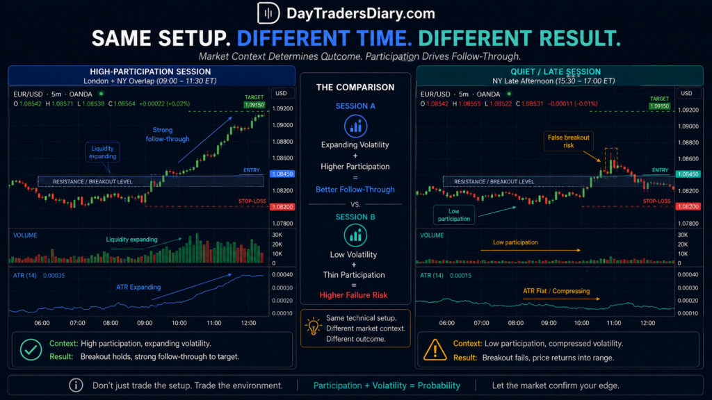
The same breakout pattern can behave differently when participation is increasing than during a quiet period with insufficient order flow to sustain the move.
CME Group research and market data also underline the significance of liquidity and participation in futures trading. This is important for active traders as execution quality might suffer with less liquidity, particularly if the strategy is based on tight stops or fast momentum.
Academic research has also documented intraday patterns in Volatility and trading activity. The well-known U-shaped pattern of market activity, in which certain periods around the opening and closing can exhibit greater activity than quieter parts of the day, has been extensively studied in market microstructure research. The National Bureau of Economic Research provides a large body of research on market behavior and intraday dynamics.
The lesson is not that you should unquestioningly trade the open and close.
The lesson is that time itself is a market variable.
That is what a heatmap allows you to test.
The Mistake Most Traders Make With Entry Timing
Most traders analyze losing trades like this:
“Did my technical setup fail?”
They should also ask:
“Did the setup fail because of the time and market state in which I traded it?”
Suppose your breakout strategy produces 55 percent winners overall.
That sounds acceptable.
But after splitting the trades by session, you discover something more useful:
Your first-session window yields a 1.1R expectancy.
Your overlap period produces 0.7R expectancy.
Your quiet-session trades produce negative expectancy.
Your strategy did not suddenly become bad.
You were averaging together three different environments.
This is where session heatmaps become valuable. They help you stop evaluating a strategy as though every trade occurred under identical conditions.
The Core Principle: Map Conditions, Not Just Clock Time
A poor heatmap just tracks the hour.
A good heatmap will indicate the time frame and also the market state.
For example:
08:00 – 09:00, Low Volatility.
08:00 to 09:00, expanding Volatility.
08:00 to 09:00, post-news conditions.
08:00 to 09:00, established trend.
These are not the same environment.
If you only conclude that “8 AM is good,” you may be creating a misleading rule.
A better conclusion might be:
My pullback method only works from 8 AM to 10 AM when the market has already set direction and volatility is above its recent average.
A trading rule you can trade on.
Build Your Session Heatmap Around the Strategy
The first decision is to stop trying to create one universal heatmap for all your trades.
Breakout trades should be analyzed separately from pullbacks.
Reversal trades should be analyzed separately from continuation trades.
If you mix everything, the heatmap can hide the edge you are trying to find.
A trader who uses the same entry model across different conditions may discover that the entry itself is not the problem. The context filter is.
This is in direct correlation with the concept of using ADX Clusters to measure trend strength. But if directional momentum is waning, a continuation trade is a terrible idea in a high-participation session. Or a minor activity window can be a decent pullback if the broader trend is intact.
Your heatmap should therefore answer two questions simultaneously:
When does my Setup appear?
When does my Setup perform well after it appears?
The second question is the one that improves entry timing.
A Practical Four-Layer Session Heatmap
The most useful approach is to build your analysis in layers.
The first layer is time. Divide your trading day into blocks that make sense for your instrument. A forex trader may use major session opens and overlaps. A futures or equities trader may use the opening, mid-session, and closing periods, then divide each into smaller blocks.
The second layer is Volatility. Record whether ATR or your preferred volatility measure is low, normal, or elevated relative to recent conditions.
The third layer is market structure. Classify whether the market is ranging, trending, breaking out, or transitioning.
The fourth layer is the quality of the execution. Track spread, slippage where applicable, max unfavorable excursion and whether your entry was at targeted price.
Now the heatmap is more than a colorful chart.
It turns into a decision model.
Step One: Start With Your Existing Trade Data
Do not begin by guessing which session should be best.
Start with your own trades.
For every completed trade, record the entry time in the same timezone. Consistency matters more than the specific timezone you choose.
Then record the setup type, market state, result in R, and a few execution variables.
After enough trades, group them into time blocks.
For example, instead of using exact timestamps such as 09:17 or 10:42, use 30-minute or 60-minute windows.
This prevents the data from becoming too fragmented.
If you divide 100 trades into 48 different time blocks, you may end up with two trades in each category. That is not useful evidence.
The goal is to have enough observations to identify meaningful patterns.
Step Two: Measure Expectancy, Not Just Win Rate
A heatmap based only on win rate can lead you in the wrong direction.
Suppose your 11:00 to 12:00 window has a 65 percent win rate, but the average winner is 0.7R and the average loser is 1R.
Now, let’s say your 09:00 to 10:00 window only wins 48 percent of the time, but provides average winnings of 2.2R.
Which is the better period?
You can’t answer based on win rate alone.
Duration of use:
Expectancy = (Win Rate × Average Win) − (Loss Rate × Average Loss)
Then compare the time blocks.
A session heatmap should help you identify where your strategy produces the best risk-adjusted opportunity, not simply the highest percentage of green trades.
Step Three: Add a Volatility Context
This is where many heatmap trading strategies become more useful.
Suppose your best entry window is between 13:00 and 14:00.
That may sound like a clear rule.
But after reviewing the data, you discover that nearly all the profitable trades occurred when the current ATR was above its 20-period average.
Now you have a stronger condition:
Trade the Setup between 13:00 and 14:00 only when Volatility is at least normal or expanding.
The heatmap has helped you combine time and market behavior.
This is also why a trader should study how to quantify news volatility before entry. Scheduled news can dramatically change the meaning of a session window. A period that normally produces orderly price movement can become highly unstable when a major economic release occurs.
Step Four: Separate Setup Quality From Session Quality
You can have a good session and still have a bad entry.
This is a significant difference.
Think about a best session window starting at 09:00.
By 09:35 price has already moved quickly, being 2.5 ATR away from its base.
You enter because the heat map shows you that historically the current session has been successful.
That is abuse.
The heatmap gives a probability context.
The location of the pricing is not changed.
A realistic sequence of choices is:
First, determine whether your technical Setup is valid.
Second, determine whether the current market state supports the Setup.
Third, check whether the session historically provides favorable execution for that Setup.
Only then consider the trade.
Time should be a filter, not an excuse to enter.
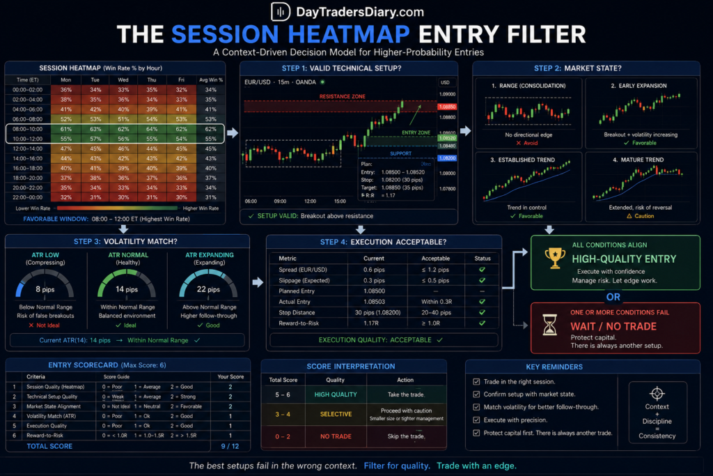
The Session Heatmap Entry Score
You can turn the process into a simple scoring framework.
Give one point for each favorable condition:
The current time falls inside a historically positive session window.
The sample size for that window is sufficient.
Current Volatility matches the profitable historical profile.
Market structure matches the Setup.
Execution conditions are acceptable.
The trade has not yet become extended.
A score of five or six does not guarantee a winner.
But it can help you distinguish between an A-quality opportunity and a technically valid trade taken in an unfavorable environment.
The purpose of the score is consistency.
You are reducing the influence of the thought that every decent chart pattern deserves to be traded.
A Forex Example Using Session Heatmaps
Imagine you trade EUR/USD breakouts.
You review 150 trades and divide them into major intraday windows.
You discover that your highest expectancy occurs during periods when liquidity is expanding, and the price has just broken from a tight pre-session range.
Your worst performance occurs later, when the same breakout pattern appears after the market has already completed a large directional move.
The chart pattern may look identical.
The timing is different.
Your new rule may be:
Take the first valid breakout from compression inside your strongest historical session timeframe. Do not enter a second or third breakout if the price has already moved over your regular intraday range.
Notice what changed.
You did not add another indicator.
You improved the location in time.
That is often a more useful improvement than searching for a more complicated entry signal.
The Hidden Value of Negative Heatmap Zones
Most traders look for green zones.
I pay just as much attention to red ones.
If your data repeatedly shows negative expectancy during a specific period, that information can be extremely valuable.
Sometimes the best trade is the one you stop taking.
For example, you may discover that your reversal setup performs badly during the first 30 minutes after a major session opens but improves substantially once the initial Volatility settles.
That finding can reduce overtrading immediately.
You do not need to find more setups.
You need to stop trading your weakest conditions.
When Session Heatmaps Fail
A heatmap can become dangerous when traders treat historical timing as a permanent law.
Market behavior changes.
Seasonality changes.
Volatility regimes change.
Your own strategy may also evolve.
A session window that worked well across one market condition may deteriorate during another.
That is why your heatmap should be reviewed as a rolling dataset rather than built once and forgotten.
You should also avoid concluding too few trades.
Five winning trades at a specific time do not prove that the hour has an edge.
The same principle applies to losing streaks.
A heatmap is a tool for detecting tendencies, not manufacturing certainty.
Session Overlaps Are Not Automatically Better
Traders often hear that more activity equals better opportunity.
Sometimes it does.
Sometimes it means more Volatility, wider movement, and more failed initial signals.
If your strategy requires clean continuation, a highly active overlap can be excellent.
If your strategy depends on tight mean reversion, that same period may be hostile.
The question isn’t:
When is the market most busy?
But the bigger question is:
When does my plan align best with the correct combination of opportunity and manageable risk?
This is the foundation of the timed session heatmap entry.
Risk Management: Timing Changes the Stop, So It Changes the Position Size
A session filter can improve entry quality, but it can also change the distance required for a valid stop.
During quiet conditions, a 10-pip stop might be structurally reasonable.
During an expanding session, the same stop may sit inside normal price fluctuation.
This is where many traders make a subtle mistake.
They keep the same lot size because the Setup looks similar, even though the required stop distance has changed.
That increases the actual monetary risk.
This is where most traders miscalculate risk. Using the Position Size Calculator on DayTradersDiary.com removes guesswork by adjusting position size to the actual stop distance rather than forcing every trade into the same lot size.
The important principle is simple.
Session quality can justify taking a trade. It does not justify increasing risk without recalculating it.
Heatmaps and Entry Delay
Session timing can also expose a problem that is easy to miss in ordinary trade reviews: entry delay.
Suppose your best heatmap window lasts from 09:00 to 10:00.
Your Setup appears at 09:12, but you hesitate and enter at 09:38.
The market has already moved.
Your original stop is now wider, your remaining reward is smaller, and the trade is no longer equivalent to the Setup of your historical data.
This relates to the problem of entry-delay risk.
Your journal should distinguish between the signal time and the actual entry time.
Otherwise, you may wrongly conclude that the session window failed when the real issue was execution deterioration.
A heatmap is only as accurate as the definition of the trade being measured.
How to Build a Personal Session Heatmap
You do not need expensive software to start.
Begin with your Trade Journal Template and create columns for entry time, session, setup type, market condition, volatility state, result in R, MAE, and MFE.
After collecting a meaningful sample, group the trades by time block.
Then calculate:
Number of trades.
Win rate.
Average win.
Average loss.
Expectancy.
Average MAE.
Average MFE.
Profit factor, if useful for your review.
The heatmap can then visually rank the periods.
But do not stop there.
Ask why the strongest periods worked.
Did they have better liquidity?
Did Volatility expand?
Were those trades aligned with the higher-timeframe trend?
Did you take fewer late entries?
The explanation is often more useful than the color on the heatmap.
Add Market State to Your Journal
I strongly recommend recording a simple market-state label.
For example:
Range.
Early expansion.
Established trend.
Mature trend.
News-driven Volatility.
Post-news stabilization.
Over time, you can compare the same session across different states.
You may find that your best time window is only truly profitable during early expansion.
That discovery is far more precise than saying, “I trade best in the morning.”
A More Advanced Heatmap: Time × Volatility × Setup
Once you have enough data, create a three-dimensional classification.
Take one Setup.
Then divide it by:
Session window.
Volatility condition.
Trend condition.
For example:
London open, rising ATR, emerging ADX cluster.
London open + falling ATR + mature ADX cluster.
Mid-session + rising ATR + range.
Mid-session + low ATR + trend formed
You’ll soon discover why a basic clock-based heatmap might be deceiving.
Often the best edge is at the intersection of variables.
This is when reviewing the data is quite helpful.
You are not trying to predict every market movement.
You are identifying the conditions under which your own decision model has historically worked best.
Do Not Optimize Yourself Into a Corner
There is a temptation to keep adding filters.
09:00 to 09:30 works.
Then only Tuesdays.
Then only when ATR is 1.3 times the average.
Then only when ADX is between 27 and 31.
Soon, you will have a perfect historical model with almost no trades.
That is overfitting.
The strongest filters are usually broad enough to survive different market conditions.
Instead of searching for exact timestamps, look for logical windows.
Instead of requiring an ATR of exactly 1.27 times normal, use broad categories such as low, normal, and expanding.
The objective is robustness.
Session Heatmaps and Trading Psychology
There is another benefit that does not appear in the spreadsheet.
Knowing your highest-quality windows can reduce the psychological pressure to trade all day.
Many day traders lose money because they keep searching after the productive part of their session has ended.
They make money during the best two hours.
Then give part of it back, trying to create an opportunity during a period when their strategy has historically struggled.
A heatmap can help you be selective.
That is not the same as becoming passive.
It means concentrating your attention where your data suggests it is most valuable.
For some traders, the biggest improvement will not come from a better entry pattern.
It will come from taking three fewer low-quality trades per week.
Scaling an Edge Requires Knowing When It Exists
A strategy that produces an overall positive result may not be ready to scale until you understand where the edge comes from.
Suppose you are profitable across 200 trades.
Good.
But what if 80 percent of your profit came from one particular session and market condition?
That matters.
Before increasing size or considering an evaluation account, you should know whether your profitability is broad or concentrated.
Professional capital programs can be useful once you have that clarity because they provide a structured environment for demonstrating consistency and accessing larger capital without requiring you to commit all of your own funds to every position.
Traders may consider The5ers, particularly if its program regulations align with their holding duration, news method and risk model. Depending on your instruments and techniques other traders could want to look at companies like FTMO or prop trading firms.
The key is not to choose a prop firm because it promises a larger number.
Choose a structure that matches the way you actually trade.
If your session heatmap shows that you only take one or two high-quality trades during specific windows, a program that pressures you into unnecessary activity may work against your edge.
A serious trader should be able to explain exactly why a trade was taken, why that time window was selected, and how the risk fits the rules of the account.
If you have already validated that process, consider researching a The5ers evaluation account as one possible route for scaling. Treat the evaluation as a test of an existing process, not as a place to discover one.
How to Use a Session Heatmap Before Every Trading Day
The best heatmap is not something you build and admire once a month. It should influence your preparation before the session begins.
A practical routine can be simple.
First, identify the market events that could distort normal session behavior. Then check the current volatility condition against the environment used to build your historical data. Next, identify the session window you are entering and the setup types that historically perform best there.
Then wait for the price.
This order matters.
Do not start with the chart and search for a reason to trade because your preferred session is open. Start with context, then let the Setup earn the entry.
For example, imagine your data show that your pullback setup performs best during the first 90 minutes of an active session, when the higher-timeframe trend is intact. The first impulsive move has already occurred.
Here’s how your pre-trade logic would look:
This session is inside my favorable window.
Volatility is increasing, not disorderly.
The bigger picture is in vogue.
The first impulse has already taken direction.
The retracement remains structurally valid.
The entry still offers an acceptable reward relative to the stop.
If one of those conditions is missing, the heatmap alone should not rescue the trade.
The Difference Between a Session Heatmap and a Trading Schedule
A trading schedule tells you when you are available.
A session heatmap tells you when your strategy has historically demonstrated an advantage.
Those are not always the same.
You may be available for six hours, but discover that your best work happens during only two of them.
That is valuable information.
Many traders unconsciously turn availability into a reason to trade.
“I am at the screen, so I should find something.”
That mindset creates unnecessary trades.
A heatmap encourages the opposite behavior.
“I am available, but is this a period where my setup and current market conditions are aligned?”
That one question can improve discipline more than adding another confirmation indicator.
Use Heatmaps to Improve Different Entry Styles
A session-heatmap trading strategy should vary depending on what you trade.
Breakout Traders
Breakout traders should examine when compression most often transitions into expansion.
Your heatmap may reveal that the first breakout during a high-participation window has much better follow-through than later breakouts.
It may also show that breakouts taken during quieter periods have a higher false-breakout rate.
This is where your research on fake breakouts with a volume filter becomes useful. Time and volume can work together. A breakout during a historically active session with expanding participation may deserve more attention than the same chart pattern appearing during a thin, quiet period.
Pullback Traders
Pullback traders should focus on the timing of the initial impulse and the quality of the retracement.
You may discover that your best pullbacks occur after the market establishes direction early in the session rather than immediately at the opening burst.
This can connect naturally to a framework for trading retracements that uses three confirmation steps. The heatmap tells you whether the market is trading during a favorable period. The confirmation framework helps determine whether the retracement itself is ready for entry.
Reversal Traders
Reversal traders need to be especially careful with session timing.
A level that produces a reliable reversal in a quiet, rotational environment may fail badly when participation and directional momentum accelerate.
Your heatmap should therefore include not only profitable reversal windows but also periods where reversal trades consistently experience large adverse excursions.
That information can be more useful than a win rate.
If your average losing reversal expands to 1.8R during a particular session while the same Setup normally loses 1R, the problem is not simply that the strategy wins less often. The execution environment itself is changing.
The Opening Burst Is Often Misunderstood
One of the most common mistakes is assuming that the first strong move of an active session should always be traded.
Sometimes that first move is the beginning of a genuine directional expansion.
Sometimes it is simply the market-clearing resting liquidity before choosing a direction.
Your heatmap can help identify which situation occurs more frequently for your instrument and strategy.
Record whether your entry occurred on:
The first directional move.
The first pullback after the directional move.
The second breakout.
A late continuation.
Then compare the results.
You may discover that your edge is not in predicting the opening move at all.
It may be in waiting for the market to reveal direction and entering during the first controlled retracement.
That is the type of insight traders often miss when they only review charts visually.
Add Maximum Adverse Excursion to the Heatmap
Most traders focus on profit.
For entry timing, MAE can be just as valuable.
Suppose two session windows produce the same average profit.
At first glance, they look equally attractive.
But one window produces an average MAE of 0.35R while the other produces 0.95R before eventually reaching the same target.
Those are different trading experiences.
The lower-MAE window may allow for tighter execution, less emotional stress, and more consistent position management.
A session heatmap that includes MAE can therefore help you identify not only where you make money, but also where your trades behave in ways that match your risk tolerance and execution style.
Look at MFE to Avoid Leaving Opportunity Untapped
Maximum favorable excursion can reveal the opposite problem.
Suppose trades entered between 09:00 and 10:00 regularly reach 2.5R before reversing, but you routinely take profit at 1R.
Meanwhile, trades during another session rarely exceed 1.2R.
Your heatmap may suggest that profit targets should not be identical across all trading periods.
This does not mean changing targets randomly.
It means testing whether session conditions influence the amount of movement available after entry.
This connects with the logic behind using ATR multiples for profit targets. A 1R or 2R target should not exist in isolation from the Volatility and movement available during the period you are trading.
A Simple Session Heatmap Framework for Active Traders
If you want a practical starting model, divide your day into logical windows and classify each trade using three variables.
The first is the time window.
The second is the market state, such as range, expansion, established trend, mature trend, or news-driven Volatility.
The third is the setup type.
Then measure the outcome in R.
After enough trades, ask:
What Setup has the best expectancy?
What time window?
What market situation?
That combination is your main area of inquiry.
For example:
Pullback + early active session + established trend = good expectation
Pullback + quiet session + low volatility = negative expectancy
That is a meaningful rule.
It is also much more useful than saying, “Pullbacks work.”
How Much Data Do You Need?
There is no magic number.
Twenty trades can reveal an idea.
It cannot reliably establish a robust edge.
Fifty trades within a single setup category can begin to provide useful evidence, but the quality of the data matters. One hundred or more observations across different market conditions will give you a much better foundation.
The important point is not to wait forever before learning.
Start reviewing with the data you have, but treat early conclusions as hypotheses.
Then continue testing.
A healthy process looks like this:
You begin to see a trend.
You make a general rule.
You try it out on subsequent trades.
You see if the effect remains.
If it does, we get more confidence.
If it goes away change the assumption.
That is a lot more powerful than building a rule off of one profitable month.
Avoid the Trap of Session Survivorship Bias
Imagine you trade mostly during one session because that is when you are available.
Your journal may show that this session produces your best results.
But compared with what?
If you have only five trades during another session, you cannot conclude that the first session is objectively better.
Your data may reflect where you have the largest sample.
Be honest about uneven data.
A heatmap should display sample size alongside performance.
A time window with 40 trades and 0.5R expectancy deserves more attention than a window with four trades and 2R expectancy.
The smaller sample might be promising.
It is not yet proven.
Update the Heatmap as Your Strategy Evolves
A heatmap built around your old trading behavior may become irrelevant.
Suppose you improve your entry process and stop chasing breakouts.
Your results after that change should not necessarily be mixed with the data from your previous behavior.
Likewise, if you change instruments, timeframes, stop methodology, or profit-taking rules, consider separating the datasets.
Otherwise, the market changed when the real change was your own strategy.
This is one of the reasons journaling is so important.
A useful Trade Journal Template should record changes in your rules, not just wins and losses.
Without that information, performance analysis becomes messy.
The Professional Use of a Heatmap
The professional use of a heatmap is not to make trading mechanical in the wrong way.
It is to reduce unnecessary decisions.
Instead of looking at every hour and asking whether you should trade, you already know which environments deserve your closest attention.
Instead of reacting emotionally to a missed move, you know whether that move even occurred during one of your validated opportunity windows.
Instead of forcing yourself to trade because you have been sitting at the screen for three hours, you can recognize that your edge may not currently be present.
That is a major psychological advantage.
Good traders are not simply good at entering.
They are good at waiting when the expected value of participation is low.
Scaling and Capital Growth: Why Timing Discipline Matters
A session-based edge can become more valuable as capital increases, but only if the process remains consistent.
This is where many traders run into trouble.
They identify a profitable two-hour window, then increase size and suddenly feel pressure to trade every minute of it.
That destroys the filter.
More capital does not require more trades.
If your historical edge comes from two high-quality setups per week, scaling should mean allocating more capital to those setups, not inventing 10 additional trades.
This is why evaluation programs can be useful for traders who already understand their process. The 5ers evaluation programs are worth considering as one route for traders looking to demonstrate consistency within predefined risk rules and scale beyond their personal account size.
It makes sense to compare multiple models simultaneously. FTMO, other private organizations that focus on forex, providers of futures evaluation, and stock-focused investment programs may have quite different regulations for daily losses, trading news, holding periods, and scaling.
The best option is not the one with the largest advertised account.
It is the one whose rules allow you to execute the strategy that your data has already validated.
If your session heatmap tells you that you trade only specific windows, maintain overnight positions, or avoid news, those details should guide the type of evaluation account you consider.
The professional route should support your edge not push you to give it up.
Frequently Asked Questions
What is a session heatmap in trading?
A session heatmap is a visual analysis of trading performance across different time periods. Traders can use it to identify when a particular setup produces the best expectancy, execution quality, volatility profile, or follow-through.
How can a session heatmap improve entry timing?
It lets traders compare the same Setup in different market times. The trader might concentrate on times that have historically demonstrated a greater expectation and more favorable execution rather than trading a legitimate pattern “at any time.”
What should I include in a trading heatmap?
At the very least, include the time window, number of trades, win rate, average outcome in R and expectation. Add market state, Volatility, MAE, MFE, setup type, execution quality for further dive.
Should I use 30-minute or 60-minute session blocks?
Up to you. Sample size and frequency of trading matters. Faster methods may profit from 30-minute blocks, while lower frequency traders may need 60-minute or broader session categories to have adequate trades in each group.
Can a session heatmap predict the next market move?
No. A heatmap does not predict the next trade. It provides historical context about when your strategy has performed well or poorly. The current technical setup and market conditions still need to be evaluated.
What is the best time of day to trade?
There is no universal best time. The best period depends on the instrument, strategy, volatility conditions, and your own execution data. A breakout trader and a mean-reversion trader may have completely different optimal session windows.
How many trades are needed before trusting a heatmap?
You might see some trends developing in the first few hundred trades but greater samples and different market conditions are more reliable. Always report the sample size, and treat conclusions from small samples as hypotheses, not as everlasting truths.
Should I stop trading during my worst heatmap period?
If you have a meaningful sample with continuously negative expectancy, it may be appropriate to reduce or eliminate trades at that point. Before you make a permanent rule of it, verify whether the low performance is due to some special situation, some volatile state, or some execution fault.
Can I combine a session heatmap with volume and ADX?
Yeah. This can lead to an improved market state filter. Time will tell you when the opportunity is there, volume can tell you about participation, and ADX can assist you categorize directional strength. The idea is to check the combo and not assume that more signs are always the better option.
Final Takeaway
The actual usefulness of a session heatmap isn’t in locating the brightest green square.
It’s learning why your best transactions are the ones you take when you do.
Your breakout plan has to broaden involvement.
Your pullback strategy may work best once the opening volatility has settled.
Your reversal trades may fail during the exact hours when you have historically been most active.
These discoveries can change your trading without changing your entry pattern at all.
For the next 30 trades, add three fields to your journal: entry time, market state, and volatility condition.
Then review the results by time block.
Do not look for a perfect hour.
Look for a consistent relationship among time, market conditions, and your strategy’s expected return.
That is the difference between using a heatmap as a colorful performance chart and using it as an actual entry-timing tool.
Next read: Review the guide on How To Classify Trend Strength With ADX Clusters and combine your session timing data with a clearer definition of whether the market is actually trending, emerging from compression, or losing directional strength.